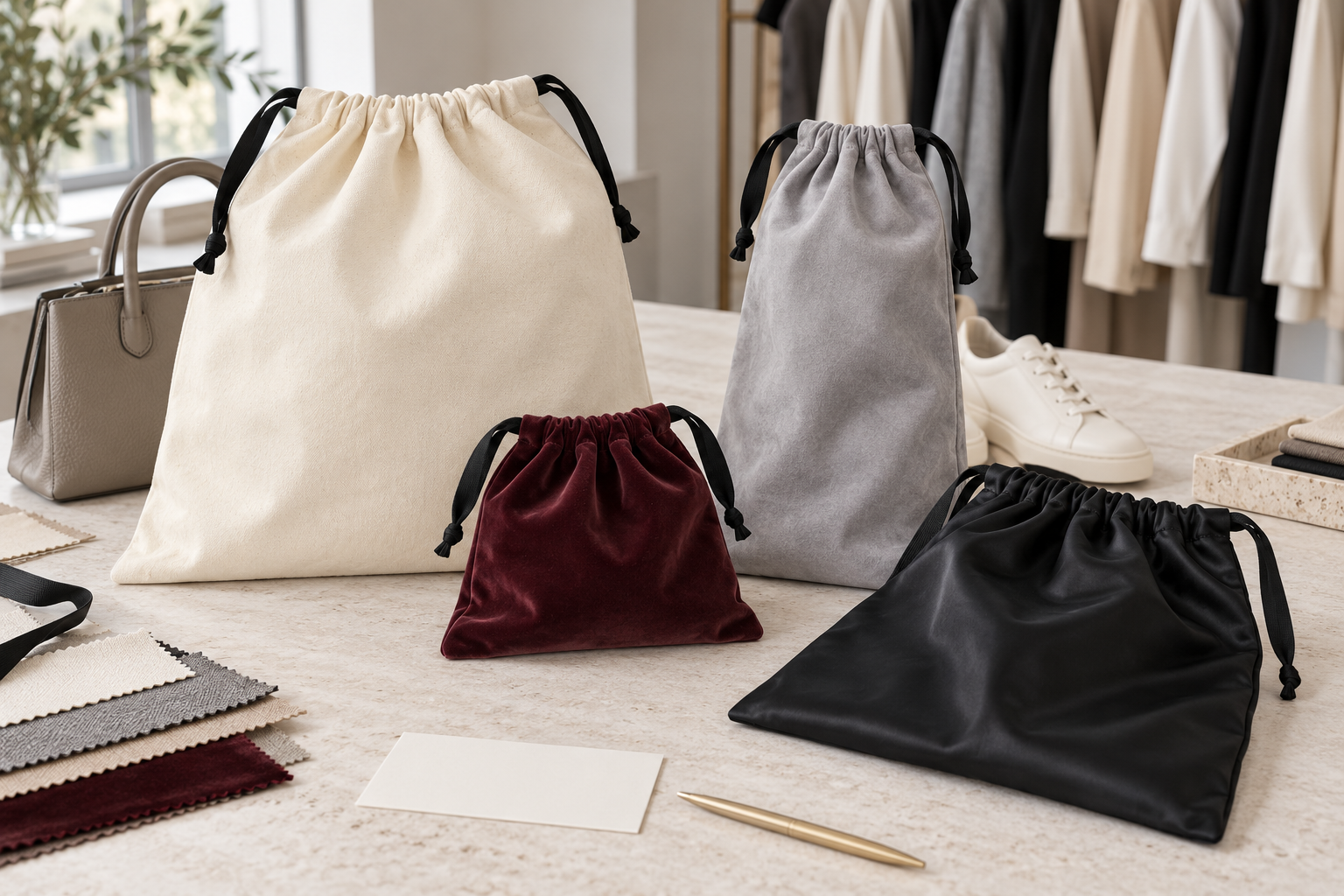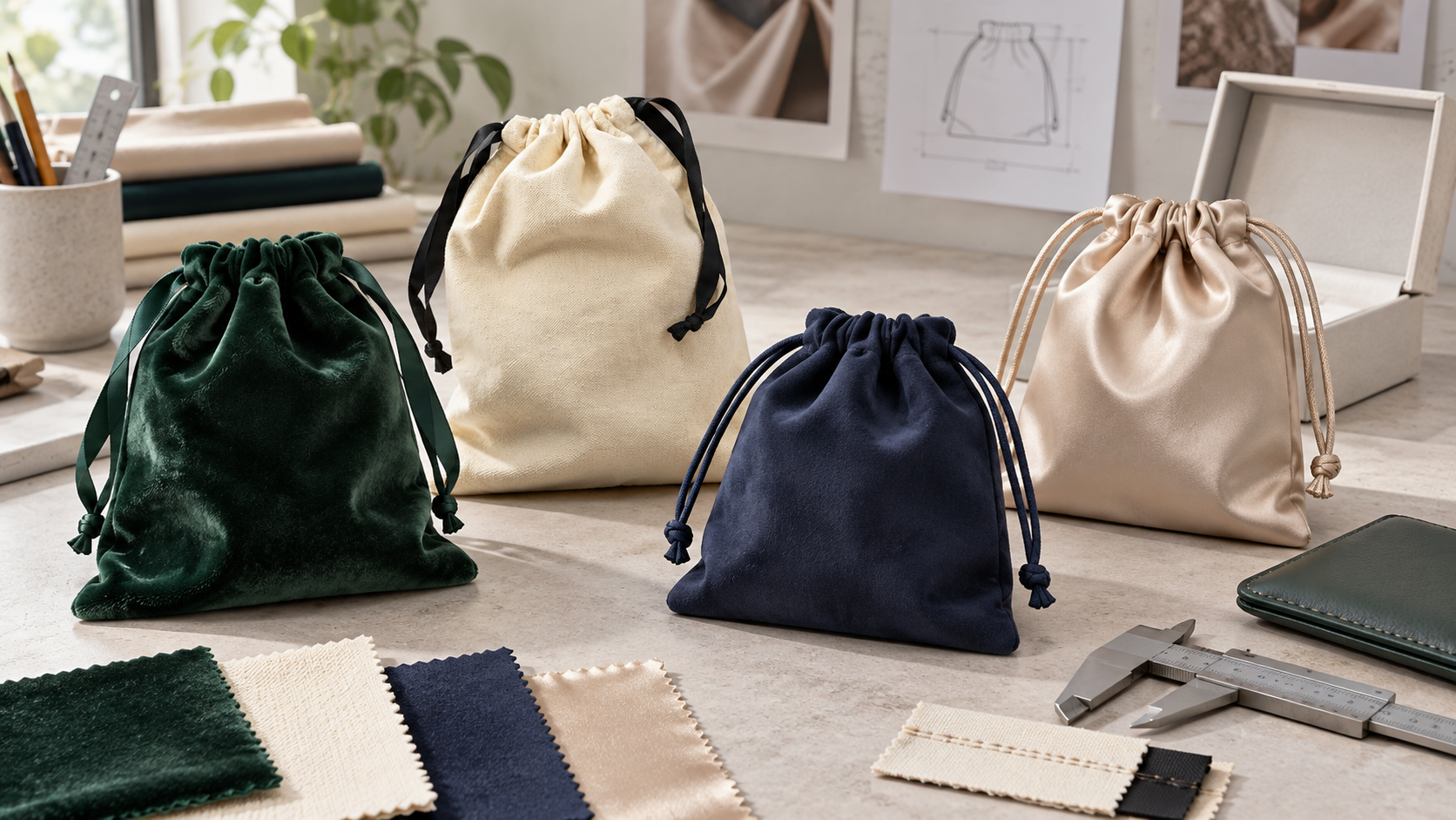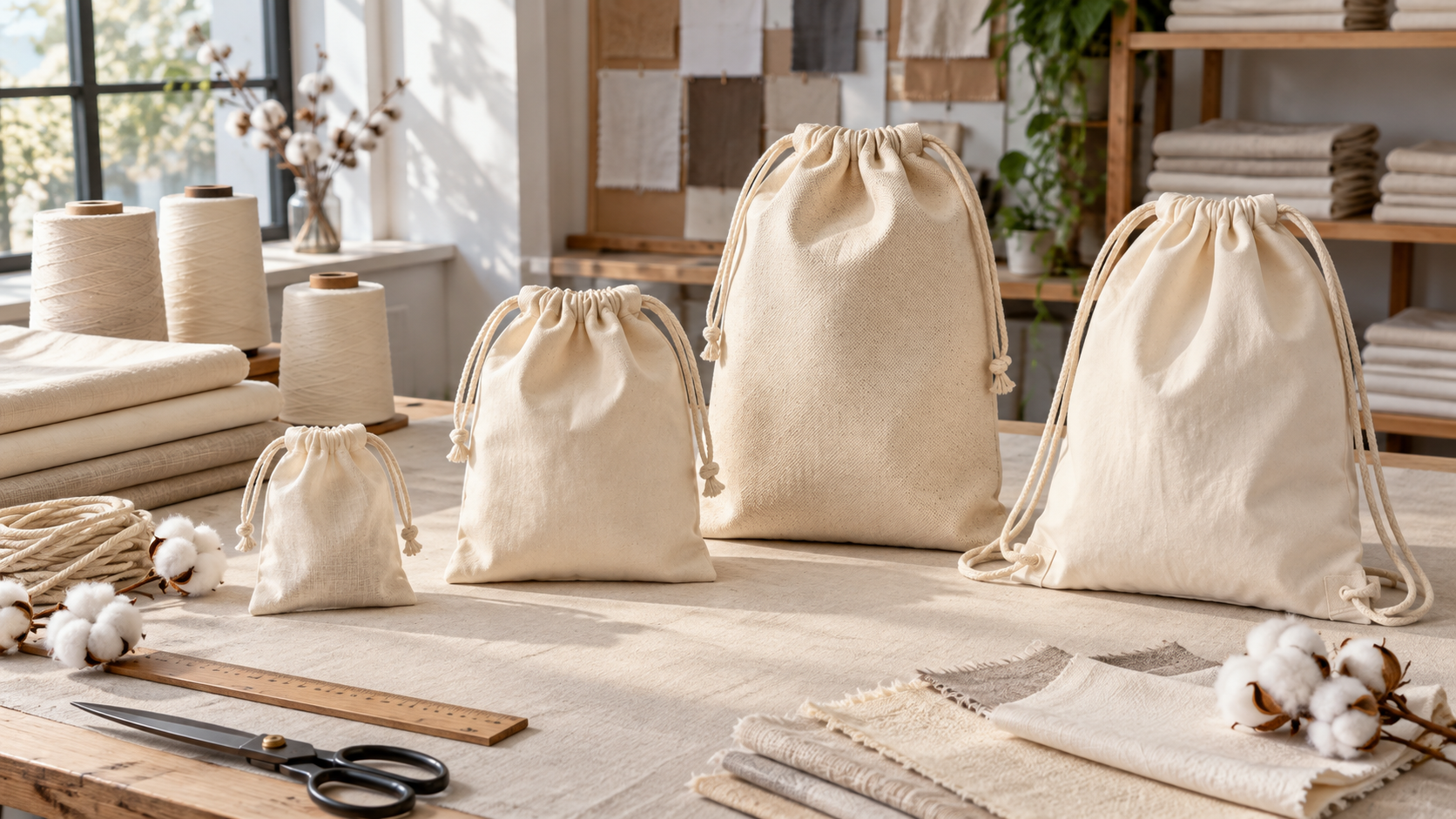
How to Design Shopping Bags That Increase Brand Visibility
A shopping bag increases brand visibility when people can identify the brand in the few seconds that the bag is actually visible: at the counter, beside a shopper, in a queue, on public transport, or during reuse. That is a harder design problem than filling a printable panel. Handles cover artwork, gussets collapse, products change the silhouette, hands hide the center, fabric absorbs ink, and a message that looks clear on a monitor can disappear at normal viewing distance.
The practical answer is to design for recognition in motion. Give the bag one dominant brand cue, protect a visible window around that cue, organize supporting information in a strict hierarchy, then test a full-size sample while it is flat, loaded, carried, partly folded, and viewed from realistic distances. This guide turns that principle into a brief, sample review, and quality-control workflow for brands sourcing custom shopping bags.
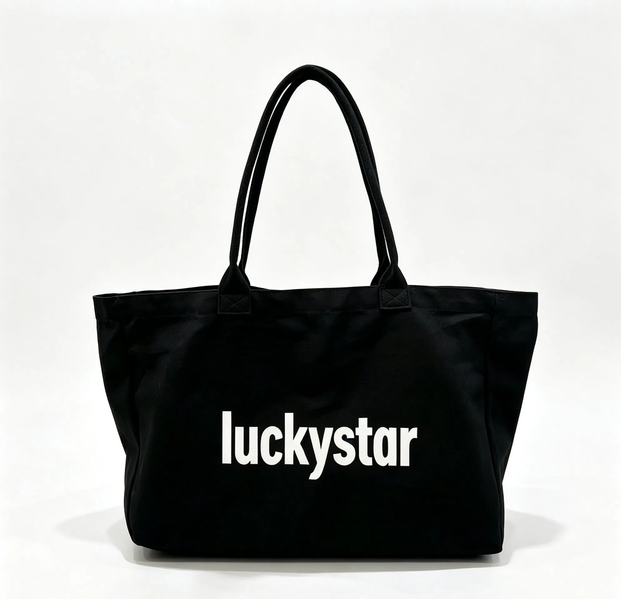
A real LUCKYSTAR-branded canvas bag shown on a company public product channel. It is used here to illustrate a dominant front-panel cue and contrasting handles; final material, construction, dimensions, decoration, and performance are order-specific.
Need a visibility-led bag review? Send the recognition objective, audience/use event, products/load, bag dimensions/handle drop/material/colour, vector artwork and rights owner, hero cue and actual print size/location, quantity by variant, QR destination, field-test condition, sample/QC gates, packout, destination and required date. The team can return manufacturability risks and a quote-ready evidence checklist for written confirmation.
The short answer: what makes a shopping bag visible?
Visibility is not the same as logo size. A large mark can still fail when it sits under a hand, crosses a fold, competes with five other messages, or loses contrast on the production material. A smaller but distinctive wordmark, color field, handle treatment, silhouette, or repeat pattern may be recognized sooner when it is given enough visual priority.
Use this six-part sequence:
- Define what the viewer should recognize first.
- Map where and how the bag will be seen.
- Reserve one unobstructed recognition zone.
- Build a primary, secondary, and optional tertiary cue hierarchy.
- Approve the design on the actual bag material at full size.
- Confirm that bulk production preserves the approved cue.
This is a design-and-validation process, not a promise that a bag will produce a particular number of impressions, sales, or social posts. Visibility creates an opportunity to be recognized; campaign reach and commercial results still depend on distribution, audience, context, brand familiarity, and measurement.
What this guide covers—and where related decisions belong
This article owns one question: can the finished shopping bag be noticed and recognized in real carry conditions? It focuses on sightlines, obstruction, hierarchy, physical contrast, movement, field testing, and visibility-focused production controls.
Several closely related topics have dedicated guides:
- For the broader role of bags in a brand identity system, read Custom Bags as a Branding System.
- For creative direction, message development, and artwork preparation, use How to Design Promotional Tote Bags.
- For printable panels, safe zones, optical centering, and measurement conventions, see the shopping bag logo placement and print size guide.
- For version control, store allocation, and retail rollout, read Custom Printed Shopping Bags for Retail Brand Campaigns.
- For attribution and post-campaign evaluation, see the retail packaging bag campaign measurement plan.
Keeping these scopes separate prevents a visibility guide from becoming a second general branding, logo-placement, or campaign-production article.
Start with a recognition objective, not a decoration list
Before choosing colors or print methods, write one sentence describing the desired recognition behavior. Useful objectives are observable:
- “A passerby should connect the bag with our store before reading the supporting line.”
- “A returning customer should recognize the seasonal collection from its color block and symbol.”
- “The wordmark should remain identifiable while the bag is shoulder-carried and half full.”
- “The bag should belong to the same family across small, medium, and large formats.”
Avoid objectives such as “make it pop,” “look premium,” or “go viral.” They express an ambition but do not tell a designer or supplier what to test. Also decide whether recognition should come from the company name, a symbol, a proprietary pattern, a signature color combination, or the bag form itself. If everything is treated as the hero, nothing becomes the hero.
Record the intended audience, use event, viewing environment, and decision owner beside the objective. A flagship-store gift bag may be examined closely; a grocery or exhibition bag may be seen mostly while moving. The same layout should not be assumed to serve both jobs.
Map the real visibility journey
A shopping bag moves through several states before it becomes a walking brand surface. Designers often review only the ideal flat front, although that may be the least common state outside a product photograph. Map the journey from storage to reuse and mark the likely viewer angle, useful exposure time, and physical obstruction at each stage.
| Touchpoint | Likely sightline | Common obstruction or distortion | Design response to test |
|---|---|---|---|
| Stored or stacked at checkout | Top edge, handle, or narrow front strip | Other bags cover most of the body | Put a secondary cue on the visible edge, handle, or upper band only if it remains manufacturable |
| Opened by staff | Front panel at arm’s length | Hands cover the upper center; body may be flat | Keep the primary cue outside predictable hand positions and away from crease lines |
| Loaded on the counter | Front and side at short range | Product volume changes shape; bottom expands | Review the artwork on a loaded sample, not only a flat sample |
| Hand-carried | Lower front, side panel, and moving silhouette | Hand and clothing cover the upper panel; bag swings | Use a cue that survives partial occlusion and motion |
| Shoulder-carried | Lower body and opposite side | Arm covers the top half; panel bends against clothing | Test lower or offset placement and front/back alternatives |
| Placed on a seat or floor | Side, gusset, and handles | Main panel folds inward or faces away | Use secondary brand coding on side panels or handles where appropriate |
| Reused later | Unpredictable distance and load | Wrinkles, wear, mixed contents, new context | Favor durable recognition cues over campaign copy that quickly becomes irrelevant |
Walk through this map with a blank bag or rough prototype. Photographs from front, back, both sides, and a three-quarter angle reveal visibility losses that a dieline will not show. Where bags are distributed by store staff, observe the handover motion as well: the way the bag is held can determine which half of the artwork disappears.
Separate the printable area from the visible window
The printable area is the region a production method can decorate. The visible window is the part a viewer can actually see in the intended use. These are not the same.
A screen-printing frame may permit a broad central panel, but a shoulder strap or shopper’s arm may cover the upper center. A paper bag may accept edge-to-edge graphics before conversion, but folds, handle knots, turn tops, and creases divide the finished view. A gusset may be printable while flat yet narrow or disappear once the bag is carried.
Create a full-size outline and overlay five zones:
- Structural exclusion: seams, folds, welds, attachments, closures, reinforcement, and trim.
- Process safe area: limits required by the intended decoration method.
- Likely hand and arm coverage: based on the intended carry style.
- Likely load distortion: areas that bulge, collapse, or wrinkle when filled.
- Recognition window: the cleanest remaining region for the primary cue.
The logo placement and print size guide explains how to dimension that area and specify safe zones. For this article, the important step is to test whether the chosen zone remains visible after the bag leaves the artwork file.
Choose one hero cue for fast recognition
A hero cue is the element expected to create the first brand connection. It does not have to be a logo. It can be a combination that the brand can use consistently and has the right to use.
| Cue level | Possible assets | Job in the first few seconds | Control question |
|---|---|---|---|
| Primary recognition cue | Wordmark, symbol, signature color block, proprietary pattern, distinctive silhouette | Trigger the first brand association | Can it still be identified when part of the bag is covered or moving? |
| Secondary brand cue | Handle color, side-panel treatment, short campaign line, repeat motif | Confirm the identity or connect the bag to a campaign | Does it support the hero instead of competing with it? |
| Tertiary information | URL, social handle, legal line, care note, QR code | Provide detail after the viewer is already engaged | Is it placed for close viewing and tested at final size? |
| Operational information | SKU, recycling instruction, country-specific mark, store code | Support compliance or handling | Can it be kept discreet without becoming unreadable or inaccurate? |
Conduct a “three-second edit.” Show the flat concept briefly, hide it, and ask a reviewer what they remember. If the answer is a list of decorative elements but not the brand cue, simplify the hierarchy. Then repeat the exercise on a physical sample at the project’s intended distance. This is a practical internal test, not a universal scientific threshold.
Research on package attention supports the need for caution: eye-tracking studies show that design features and context influence attention, but the package that attracts the most attention is not necessarily the one people prefer or judge appropriate. The implication is not “make everything louder.” It is to select the right cue, test it in context, and confirm that visibility still feels like the brand. See the study Seeing is not necessarily liking: Advancing research on package design with eye-tracking.
Use contrast as a physical result, not a screen value
Contrast on a shopping bag depends on the actual substrate, ink or film opacity, surface texture, coating, weave, gloss, and lighting. A dark blue logo on natural canvas may behave very differently from the same color on coated white paper. A display mockup cannot predict ink absorption, fabric show-through, lamination gloss, or the way a coarse weave breaks small details.
Specify color by role:
- Brand-critical colors: require an approved reference and controlled review conditions.
- Supporting colors: may use an agreed visual range if exact matching is not essential.
- Material color: must be evaluated as part of the composition, not treated as a neutral background.
- Metallic, fluorescent, transparent, or textured effects: need physical trials because screen previews are especially unreliable.
For an order that requires critical color control, provide a named color reference and agree how the physical sample will be assessed. Pantone versus CMYK for custom shopping bags explains the roles of spot and process color, while the shopping bag color matching and bulk approval guide covers ink drawdowns, approved references, and production comparison.
For formal print evaluation, align the viewing setup with the project’s requirement. The current ISO 3664:2025 specifies viewing conditions for critical and practical evaluation of reflective and transmissive prints. Referencing the standard is not the same as claiming certification; use it only when the order requires that level of controlled viewing.
Let the material support the visibility strategy
Material affects more than durability and price. It determines surface texture, color base, edge definition, fold behavior, opacity, and the way a bag holds its silhouette. Those properties influence which visual cue stays recognizable.
- A smoother, lighter paper can support fine type or detailed process imagery, subject to the chosen grade, coating, conversion, and print route.
- Cotton and canvas can create a tactile, reusable format, but weave and natural shade may soften fine artwork or change perceived color.
- Non-woven and woven polypropylene can support lightweight or structured formats, but surface treatment, lamination, heat, seams, and registration need to be considered.
- Jute and other coarse natural-look materials often favor larger, simpler marks or a separately engineered decoration area.
- Mesh and transparent constructions may make the contents part of the visual field, so a patch, pocket, label, or opaque panel may need to carry the hero cue.
The detailed tradeoffs belong in How Shopping Bag Materials Affect Print Quality. Use that guide to shortlist material and process combinations; use the visibility tests here to decide whether the chosen result is recognizable in use.
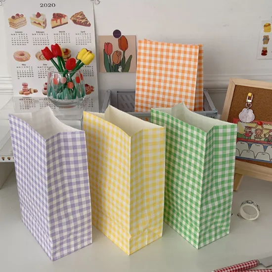
Real paper bag colorways shown on a LUCKYSTAR public product channel. The group illustrates how a repeated graphic system can connect variants; it does not establish material composition, color tolerance, strength, or any environmental claim.
Design a system that survives multiple bag sizes
Retail programs often need more than one size. Scaling the same artwork by a fixed percentage can make the smallest bag crowded and the largest bag strangely empty. Instead, define a responsive bag system.
Keep the hero cue consistent in character, but allow controlled changes in scale, crop, spacing, or orientation. Set separate artwork masters for each finished size. Decide whether the cue aligns to the bag center, an optical center, a fixed distance from the opening, or another documented datum. Do not instruct production to “scale proportionally” without showing the approved result for every format.
Test the set together:
- Can shoppers recognize that all sizes belong to the same brand family?
- Does one size unexpectedly dominate when bags are displayed together?
- Is the logo readable on the smallest size without becoming excessive on the largest?
- Do handles and gussets preserve the same color and structural logic?
- Does the design remain coherent when only the side or top of each bag is visible?
The shopping bag size and capacity guide for retailers helps establish physical formats. The visibility system should be approved only after those dimensions and carry methods are stable.
Use front and back panels intentionally
Printing both sides does not require duplicating both sides. A useful architecture is:
- Recognition side: hero cue, strong contrast, minimal copy.
- Engagement side: campaign message, URL, QR code, product story, or instruction for close viewing.
This division gives the bag a clear long-range face and a richer close-range face. It also protects the primary cue from legal or operational copy that must be included but does not need equal prominence.
If both sides are identical, specify orientation carefully. Some construction routes can make “front” ambiguous once handles, side seams, pockets, or closures are added. Mark each artwork as front, back, left gusset, right gusset, inside, or handle, and include an assembled-bag visual. The custom shopping bag tech pack guide provides a framework for recording these details.
Treat handles and gussets as secondary recognition surfaces
Handles and gussets are valuable because they are sometimes visible when the main panel is not. They are also structurally sensitive areas, so decoration should follow the construction instead of weakening it.
Possible secondary cues include:
- a contrast handle that echoes a brand color;
- woven, printed, or stitched handle detail where the specified material and method allow it;
- a short repeat motif on a paper-bag gusset;
- a small side symbol aligned with the main panel;
- an interior color revealed when the bag opens;
- a label or patch placed outside stress and fold zones.
Do not add an effect merely because the surface exists. A high-contrast handle can help recognition, but it can also compete with the wordmark. A printed gusset may look generous on a flat file and become visually compressed after folding. Approve these features on an assembled sample and include their positions, colors, materials, and acceptable variation in the specification.
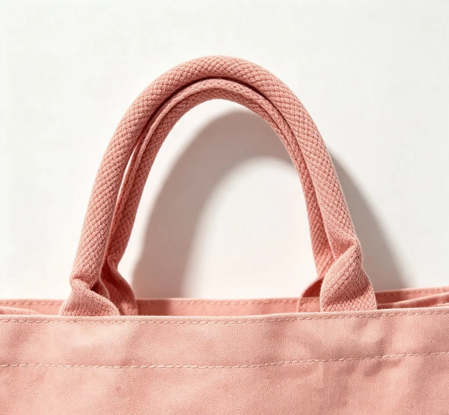
A real handle and upper-edge detail from a product shown on a LUCKYSTAR public channel. It illustrates how handle color, attachment, and the top edge become part of the visible identity. The photograph supports appearance only.
Design for hands, clothing, folds, and movement
Occlusion is predictable enough to test. Ask several people to carry the sample naturally, rather than posing it toward a camera. Use the intended load and handle length. Capture still frames or short internal test videos from the front, rear, and passing side.
Check whether:
- a hand covers the first letters of a wordmark;
- the shopper’s arm hides the entire symbol;
- dark clothing eliminates a dark bag silhouette;
- the center fold breaks a face, letter, or QR code;
- the loaded gusset pulls the logo out of shape;
- glare on a laminated surface hides light artwork;
- the bag swings so quickly that detailed copy becomes visual noise;
- the back panel becomes the dominant view more often than the intended front.
If a cue fails, change the architecture before merely increasing its size. Offset placement, a shorter wordmark, a repeat element, a contrasting silhouette, or a secondary side cue may solve the actual problem more effectively.
Keep typography readable and messages short
Shopping bags are not brochures. Long text is usually encountered at close range, while brand recognition often happens farther away and during movement.Use typography in layers:
- Brand name or primary statement.
- Short supporting line.
- Close-view information such as a URL or required text.
Avoid testing readability only at 100% zoom. Print the artwork at actual size, attach it to a blank bag, and view it at the project’s chosen distances. Review the least favorable likely condition—not only a bright studio. Fine reverse type, low-contrast colors, condensed letterforms, and thin lines deserve extra caution on textured or absorbent material.
There is no single minimum type size that applies to every bag, material, method, message, market, and viewing distance. Required legal or labeling information must be checked against the applicable destination rules and the order specification. For ordinary campaign copy, field testing is more useful than inventing a universal number.
Do not let QR codes weaken the recognition surface
A QR code is an action device, not usually the primary identity cue. Put it where a person can stop, flatten or steady the bag, and scan it without fighting a fold, seam, curve, glare, or moving handle. Keep a clear quiet zone and generate the final code from the intended live destination.
Validate a printed sample with several current phones under relevant lighting. Test the finished bag when empty and loaded. If the link is campaign-specific, decide who owns redirects, analytics, privacy review, and the landing page after the campaign ends. Never assume that a code which scans on a PDF will scan on woven fabric or a glossy, curved paper bag.
The retail packaging bag campaign measurement plan covers attribution, test structure, and post-campaign learning. Keep the code subordinate to the visual cue unless direct response is explicitly the bag’s primary job.
Make the bag recognizable in the store before it leaves
Brand visibility begins at the handover. If shopping bags are hidden in a drawer, issued inconsistently, or held with the artwork facing staff, an outdoor visibility strategy loses its first exposure.
Review the in-store operation:
- Where are unused bags stored and which surface is visible?
- How does staff open, load, and present the bag?
- Which side faces the shopper at handover?
- Is tissue, a sticker, a receipt, or a product box likely to cover the cue?
- Are several sizes stacked together and still easy to identify?
- Does seasonal stock need a visual code that prevents the wrong version being issued?
A short staff instruction or packing visual can protect the design without turning the bag into an operational burden. For multi-store launches and artwork versions, use the workflow in Custom Printed Shopping Bags for Retail Brand Campaigns.
Build a full-size visibility prototype before a production sample
An inexpensive paper plot, transfer print, or pinned artwork sheet can answer composition questions before a fully decorated sample. The prototype does not prove final color, adhesion, durability, or workmanship, but it can expose a poor sightline early.
Use a blank bag in the intended size and follow this sequence:
- Place the artwork at actual dimensions using the proposed datum.
- Photograph the flat front and back square-on.
- Load the intended product combination.
- Test hand and shoulder carry with several users where applicable.
- View the bag against light, dark, and visually busy backgrounds.
- Check at project-specific near, mid, and far distances.
- Rotate the bag and note the first cue visible from each approach.
- Record changes on the artwork and specification with a revision number.
Do not turn “visible at X meters” into a generic supplier promise. The meaningful distance depends on cue shape, size, color, lighting, movement, eyesight, background, material, and brand familiarity. Define and validate the distances for the specific project.
Use a field-test scorecard instead of opinions alone
Comments such as “make it bolder” are difficult to action. A scorecard makes reviewers describe the failure state and connects it to a design control.
| Test | Pass question | Evidence to capture | If it fails |
|---|---|---|---|
| First-cue recall | Do reviewers name the intended cue after a brief exposure? | Responses by bag version and viewing state | Reduce competing elements or strengthen the hero cue |
| Near-view recognition | Is the brand identifiable at the project’s close interaction distance? | Photograph and reviewer result | Correct contrast, type, or placement |
| Mid-distance recognition | Is the primary cue distinguishable in the intended environment? | Distance, lighting, background, and result | Simplify shape or improve physical contrast |
| Partial-occlusion test | Does the identity survive when a hand or arm covers part of the panel? | Carried photographs from both sides | Move, repeat, or shorten the cue |
| Loaded-form test | Does filling the bag preserve the cue and silhouette? | Product load, bag dimensions, images | Adjust scale, position, gusset, or construction |
| Movement test | Is the bag recognizable while a person walks past? | Short video or frame sequence | Remove fine detail; strengthen broad forms |
| Variant-family test | Do all approved sizes and colors still read as one system? | Lineup photo and version list | Normalize hierarchy, color roles, or handle logic |
| Close-action test | Do URL, QR code, or supporting text work when intentionally viewed? | Scan record and actual-size print | Change placement, size, quiet zone, or substrate |
Use the same test script for design alternatives. Change one variable at a time where practical. Keep the chosen sample, photographs, artwork revision, and decision notes as part of the project record. A later reorder is easier to control when the visibility decisions are documented instead of remembered.
Translate the winning design into a production specification
Once the visibility architecture is approved, remove ambiguity before quoting or sampling. The specification should state:
- finished bag dimensions and how they are measured;
- material, color, construction, handles, gussets, closures, and reinforcement;
- artwork file, revision, side, orientation, actual decoration size, and location datum;
- color references and the agreed physical approval route;
- decoration method and any required underbase, coating, lamination, patch, or backing;
- which sample or strike-off becomes the production reference;
- visibility-critical defects, measurement tolerances, and acceptance method;
- packing, folding, carton marks, and rules that prevent artwork versions being mixed;
- destination, required date, testing needs, and documentation requirements.
Use the custom shopping bag tech pack guide to build the master file. Quantities, pricing, sampling depth, tooling, and production timing depend on the final specification and written confirmation. The shopping bag MOQ and production time guide and custom shopping bag cost guide explain the variables without treating a web price or general lead time as a permanent promise.
Approve visibility on the intended material and construction
A digital proof checks content and layout. It does not prove the physical result. Depending on the order and process, the approval path may include a material swatch, ink drawdown, strike-off, printed panel, development sample, or pre-production sample.
Define what each approval closes:
- Material reference: base shade, texture, thickness or weight direction, and intended use.
- Color trial: ink or decoration appearance on the actual or agreed representative substrate.
- Printed panel: artwork size, position, edge quality, opacity, and surface interaction.
- Assembled sample: visibility after seams, folds, handles, gussets, loading, and carry.
- Pre-production reference: the final controlled standard for bulk production, subject to the written order agreement.
The custom shopping bag sample development process explains how to assign decisions to sample stages. Do not write “approved” without the item, version, date, reviewer, and conditions of approval.
Protect the hero cue during production quality control
Visibility can be lost even after the design is approved. A small placement drift may move the wordmark toward a seam; inconsistent underbase coverage may weaken contrast; a handle attached at the wrong position may cover the cue; folding can create a permanent crease through the artwork.
Prioritize the features that affect recognition:
| Visibility risk | Production control | Evidence or reference | Release question |
|---|---|---|---|
| Logo or symbol shifts toward a seam or handle | Measure from the agreed finished-bag datum | Approved artwork, placement diagram, sample | Is placement inside the written order tolerance? |
| Brand color loses contrast | Control material lot, ink formula, opacity, and viewing method as agreed | Approved material and color reference | Does the result remain within the approved range under agreed conditions? |
| Fine detail fills, breaks, or feathers | Confirm artwork suitability and first output on production material | Approved strike-off or printed panel | Are critical forms still identifiable at actual size? |
| Panels or gussets distort the cue | Inspect the assembled, loaded shape | Approved finished sample and loading method | Is the hero cue intact in the intended use state? |
| Handle or trim covers artwork | Verify attachment position and handle drop | Construction drawing and approved sample | Does normal carry preserve the recognition window? |
| Versions or sides are mixed | Use version codes in files, work orders, inspection, and cartons | Approved version matrix | Does each packed SKU contain the correct artwork? |
| Folding creates a visible crease | Approve the folding and packout method | Packing specification and trial pack | Is the critical cue protected after unpacking? |
For a full inspection sequence, use the custom shopping bag quality control checklist. For decoration-specific checks, see the shopping bag printing quality control checklist and common shopping bag printing defects and prevention guide.
Use print methods to serve the cue, not dictate it
Screen printing, heat transfer, digital routes, sublimation on suitable polyester constructions, embroidery, patches, labels, and pre-printed laminated panels each support different artwork, materials, quantities, hand feel, and approval needs. No process is universally “most visible.”
Start with the recognition job and shortlisted substrate, then ask:
- Can the method reproduce the cue’s edge, color, opacity, and minimum detail?
- Does the process change the hand feel or flexibility in an important area?
- Will the decoration cross seams, folds, or high-stress locations?
- Does the required coverage alter cost, setup, or consistency risk?
- What physical proof is appropriate before bulk production?
- Which defects should be named in the inspection criteria?
Compare the options in the custom shopping bag printing methods guide. Then approve the selected method on the intended material; do not infer final visibility from a different fabric, coating, or sample.
Avoid seven common visibility mistakes
1. Making every element equally loud
Multiple logos, headlines, icons, URLs, patterns, and claims compete for the same glance. Assign one primary cue and make every other element prove that it supports the hierarchy.
2. Using the whole printable panel
Maximum coverage can reduce clarity and increase sensitivity to seams, folds, registration, texture, and cost. Start from the visible window, not the supplier’s theoretical maximum.
3. Approving a monitor mockup as the final appearance
Screens emit light; bags reflect it. Material shade, texture, opacity, gloss, and lighting change the result. Approve a physical reference appropriate to the order.
4. Placing the hero cue under the carrying hand
Test natural carry before freezing placement. The middle of the artwork file is not always the center of attention on the finished bag.
5. Shrinking one master across every size
Create and approve a master for each format. Preserve system logic rather than a single scale percentage.
6. Treating a QR code as proof of engagement
Scanning requires a working print, usable placement, live destination, and a reason to act. Measure the actual campaign rather than assuming visibility equals response.
7. Allowing the approved cue to drift on reorders
Retain an approved sample, material and color references, artwork revision, placement measurement, and inspection record. For a repeat-order control plan, consult the reorder consistency guide.
A practical visibility brief for supplier review
Send enough information for the supplier to evaluate the design as a physical product. A useful first brief includes:
- brand-visibility objective and intended first cue;
- bag use event, audience, distribution channel, and expected reuse;
- representative products, intended load, and carry method;
- requested material route, dimensions, gusset, handles, and closure;
- actual-size vector artwork and a read-only visual reference;
- front, back, side, handle, and interior decoration locations;
- color references and which colors are brand-critical;
- visibility test conditions and approval owner;
- quantity by size, color, and artwork version;
- unit packing, folding, carton marking, and destination;
- required date, testing, labeling, and documentation needs;
- reference sample or photographs, with permission to use any brand assets supplied.
If some choices remain open, label them clearly and ask for options. “Recommend a print route for this artwork on these two shortlisted materials” is answerable. “Please make it premium and visible” is not.
Company-claim boundary: LUCKYSTAR statements in this section are publisher self-description, not third-party verification, proof of current material/capacity availability, rights clearance, ISO certification, campaign-performance evidence or a guarantee of recognition, impressions, sales or ROI. Product route, materials, samples, tests, MOQ, price, packing and timing are subject to current evidence, final scope and written confirmation.
How LUCKYSTAR describes its visibility-led bag review
LUCKYSTAR states that its project team can coordinate bag format, artwork, sampling, production and inspection information for an agreed custom-bag project.
- Define the recognition job: identify audience, use event, sightline, exposure, obstruction, required first cue and approval owner.
- Map the physical window: separate printable area from what remains visible when the bag is loaded, held, shoulder-carried, folded or moving.
- Translate the cue: connect artwork revision, actual size, coordinates, protected space, material/base colour, print route, opacity and QR or close-view content.
- Prototype the condition: review actual-size layouts and a production-representative finished bag empty/loaded, from both sides and at agreed distances/backgrounds.
- Release measurable controls: record material/colour reference, artwork identity, cue position, edge/colour/contrast rules, variant mapping and reapproval triggers.
- Retain repeat evidence: preserve approved sample, field-test record, specification, inspection results, accepted deviations and change history.
Review the public custom shopping bag range, the logo-placement guide and the retail campaign guide. Then send the recognition objective and actual-size artwork for review.
What to send for an actionable quotation
An efficient quotation begins with decisions, not adjectives. Send LUCKYSTAR:
- Finished width, height, and gusset, plus how dimensions are defined.
- Intended contents, load, opening, and hand or shoulder carry requirement.
- Preferred material and color, or two routes to compare.
- Handle material, width, drop, color, and attachment direction.
- Vector artwork, color references, actual print dimensions, sides, and orientation.
- Primary visibility cue and any agreed field-test requirement.
- Quantity by size, color, artwork, and market version.
- Packing, carton marking, destination, and required delivery date.
- Testing, documentation, labeling, or destination-market requirements.
- Which points are fixed and where alternative recommendations are welcome.
LUCKYSTAR can then review the request against a manufacturable route and identify the decisions needed for sampling. All commercial and production terms remain subject to the final specification and written confirmation.
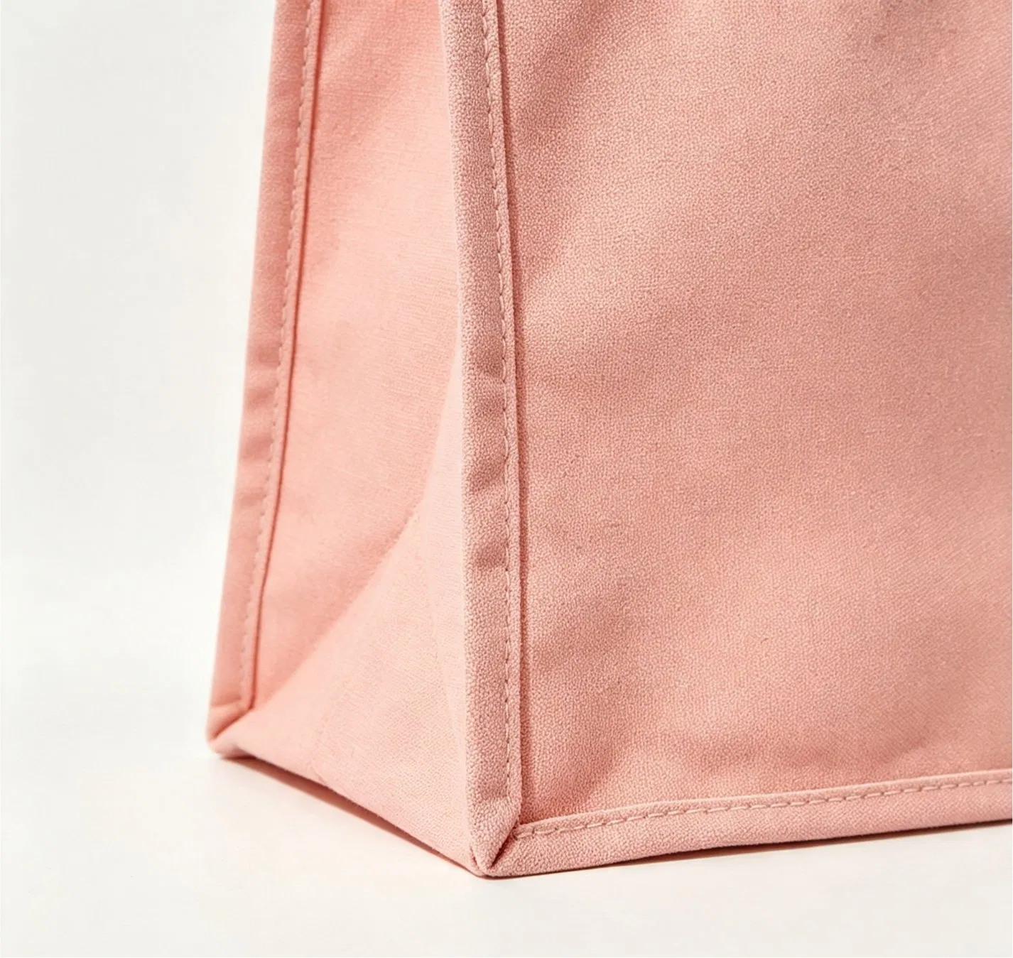
A real gusset and side-panel detail from a product displayed on a LUCKYSTAR public channel. It shows why a side artwork zone changes after folding and assembly; it does not prove a material specification, load rating, or production tolerance.
Frequently asked questions
Should the logo be as large as possible?
No. It should be large enough for the project’s recognition objective while remaining clear of obstructions, folds, seams, and competing information. Test actual-size alternatives on a finished-size bag. A distinctive cue with clear contrast and protected space can outperform a larger but crowded mark.
What is the best logo position on a shopping bag?
There is no universal position. It depends on the bag dimensions, handle drop, gusset, construction, carry style, artwork shape, and intended sightline. Define a datum, safe zone, and order-specific tolerance, then test the loaded bag. The dedicated logo placement and print size guide covers this decision in detail.
How many colors should a highly visible bag use?
There is no fixed number. A limited palette can create a clear hierarchy, while a multicolor graphic can work if it preserves one dominant cue. What matters is the physical contrast, process suitability, brand fit, and consistency of the approved result.
Can a material color become the main brand cue?
Yes, when the brand is entitled to use the visual system and the color can be sourced and controlled appropriately. But material lots, texture, lighting, coatings, and adjacent inks affect perception. Approve a physical material and finished decoration reference rather than relying on a screen swatch.
How should visibility be tested before bulk production?
Use an actual-size prototype and an assembled sample. Test the bag empty and loaded, hand- and shoulder-carried where relevant, partially covered, moving, and viewed against representative backgrounds at project-defined distances. Record the conditions, version, result, and approval decision.
Does a visible shopping bag guarantee more sales?
No. Visibility can improve the chance that the brand cue is noticed or recognized, but sales depend on many other factors. Use campaign distribution and measurement data to evaluate commercial performance; do not present design visibility as guaranteed return on investment.
Can the same approved design be repeated on a reorder without review?
Reorders still need controlled references and a change review. Material availability, color lots, equipment, process settings, artwork files, and packing can change. Compare the new order with the retained approved references and define what requires renewed approval.
Final checklist: design for the bag people actually see
Before releasing a shopping bag design, confirm that:
- the project has one observable recognition objective;
- one hero cue clearly outranks supporting information;
- the recognition window excludes structural and carry obstructions;
- every size has an approved, actual-size artwork master;
- contrast has been reviewed on the intended physical material;
- front, back, gusset, handle, and interior roles are documented;
- the bag has been tested flat, loaded, carried, partly covered, and moving;
- close-view actions such as QR codes work on the finished sample;
- an approved sample and revision-controlled specification exist;
- production inspection protects cue position, color, edge quality, and version;
- claims, logos, images, and certifications are cleared for the intended use;
- commercial terms are confirmed for the exact order.
A shopping bag becomes visible when brand intent, bag construction, artwork, and real-world testing agree. Start with the recognition job, simplify the cue hierarchy, validate the finished object, and protect the result through approval and quality control.

Send your bag dimensions, material direction, artwork, colors, quantities, destination, target date, and visibility objective for an order-specific review and quotation.
Request a visibility-led shopping bag review
Send one brief that connects the recognition objective, real carry condition, bag construction, actual-size artwork and approval evidence.
Review LUCKYSTAR custom shopping bag options, then send your visibility and artwork brief through the contact form or Email a project brief. The email link opens a draft for your review before sending.
Entity/site assignment, rights, material and capacity availability, samples, tests, campaign performance, price, MOQ, packing, schedule and release terms are subject to due diligence, current specification and written confirmation.