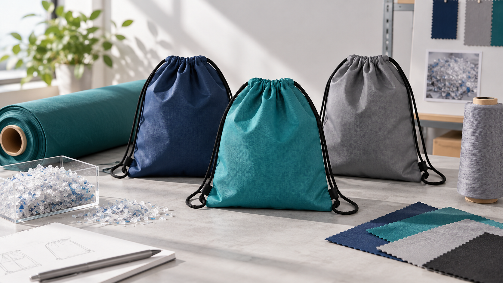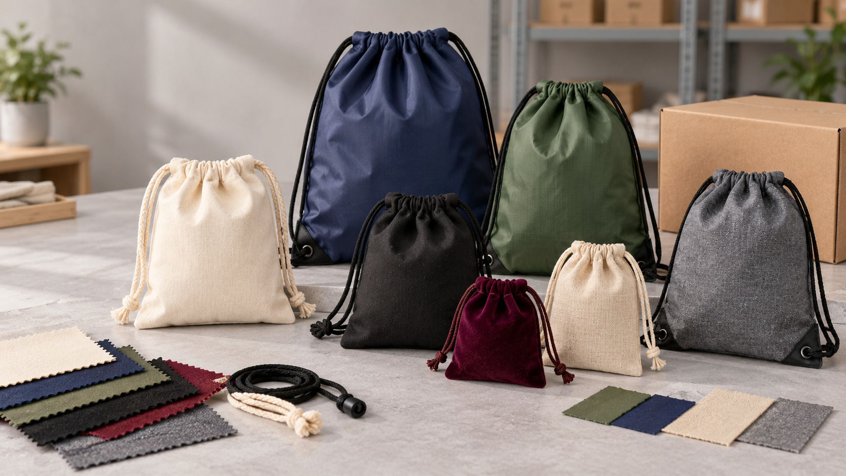
A brand may provide a Pantone number, a CMYK build, an RGB logo and a HEX value in the same artwork package. Those references are not interchangeable. A Pantone spot colour normally means a separately prepared ink or named colour station. CMYK means that cyan, magenta, yellow and black separations combine through dots or other process screening to simulate many colours. The final result also depends on material shade, surface texture, opacity, white ink, coating or film, print route and viewing condition.
This guide compares Pantone vs CMYK for Custom Shopping Bags as production choices. It explains when a spot colour protects a brand identity, when four-colour process is the practical route for photography and gradients, and when a hybrid CMYK-plus-spot plan makes sense. It deliberately does not repeat the complete shade approval sequence in the shopping-bag colour approval article; instead, it focuses on selecting and specifying the colour-separation system before approval begins.
Compare suitable materials and constructions in LUCKYSTAR’s shopping-bag product collection. Use the Shopping Bags manufacturer-selection pillar for category sourcing and the main custom bag sourcing pillar for wider factory due diligence.
Planning an order? Send a colour-system brief. Include bag material/body colour/layer stack, named print route, artwork and linked images, spot/CMYK/white/finish separations, physical brand target, quantity by SKU, proof and finished-sample gates, viewing/measurement condition, tolerance goal, packing, destination and required date.

A real full-print floral shopping bag from LUCKYSTAR’s Alibaba store. It illustrates the type of multicolour artwork that may favour a process-colour route; the finished photo alone does not prove the exact ink set or separation method used for a specific order.
1. Pantone is a colour reference; spot colour is the printing decision
Pantone Matching System references help designers, buyers and printers communicate a target. In production, a spot colour is normally printed from its own separation using a prepared ink. The physical appearance is not generated by the number alone. Ink chemistry, pigment strength, substrate colour, coating, deposit, cure and gloss all change the result.
A suffix such as C or U on many Pantone graphics references refers to coated or uncoated paper presentation. A cotton tote, non-woven PP, laminated woven PP, PVC bag or jute carrier is neither of those paper conditions. The Pantone swatch can communicate intent, but the factory must formulate and test an ink system suitable for the actual shopping-bag surface.
Pantone’s official coated/uncoated reference helps explain why a guide suffix describes a paper presentation rather than a universal appearance on every bag material. Use the named swatch as a communication target, then approve the actual ink formulation and physical result on the production substrate.
2. CMYK creates colour through four process separations
CMYK uses cyan, magenta, yellow and black in screened percentages. Different dot combinations create the visual impression of many colours and continuous tone. Four process separations can reproduce a photograph without requiring a separate premixed ink for every colour visible in the image.
CMYK is device- and condition-dependent. The same numeric build can look different when the press, ink set, substrate, screening, colour profile or white backing changes. A file prepared for coated paper is not automatically a reliable target for canvas or reverse-printed film. The converter needs the intended production condition and should return a proof or characterization route that reflects it.
Adobe’s colour-separation guidance explains that continuous-tone images are typically separated into cyan, magenta, yellow and black plates, while custom spot inks create additional separations. This is why an apparently simple artwork file can create four, five or more printing stations.
| Decision factor | Pantone / spot colour | CMYK process | Hybrid CMYK + spot |
|---|---|---|---|
| Typical artwork | Logo, flat vector icon, line art, one-to-three key colours | Photography, gradients, multicolour illustration | Photo/illustration plus protected corporate colour |
| Ink/separation count | One station/plate/screen per spot colour | Usually four process separations, subject to the named system | Four process separations plus each additional spot/finish |
| Strongest advantage | Controlled brand solid and possible out-of-gamut/specialty appearance | Many colours from a fixed process set | Complex image without sacrificing a critical brand solid |
| Main limitation | Costs and setup increase as spot count grows | Not every spot target is achievable; register and screening matter | Extra station, plate/tool, trapping and approval complexity |
| Proofing priority | Physical drawdown/strike-off on actual material | Colour-managed process proof and production sample | Both process image and spot interaction/trap |
3. Start with artwork content, not a colour-code preference
Count what the artwork asks the press to reproduce. A black logo and one orange icon may be a two-spot job even if the designer supplied CMYK values. A lifestyle photograph with hundreds of visible shades should not be converted into dozens of spot inks. A photographic campaign containing one protected orange logo may be a four-process-plus-one-spot job.
Build a separation map before requesting prices. List every named spot, process image, white underbase/backing, varnish, metallic or other finish. Confirm whether black text uses process K, a specially mixed black or rich black made from several process inks. For small text on flexible material, a single black separation can reduce register risk compared with a multi-ink rich black.
| Artwork brief | Likely starting route | Question before confirmation | Hidden extra separation |
|---|---|---|---|
| One-colour logo on natural canvas | One spot ink | Does body colour affect opacity or shade? | Possible opaque base on dark fabric |
| Two flat brand colours | Two spot colours | Are both within press/material capability and registered? | White may become a third station |
| Photograph or botanical illustration | CMYK or qualified expanded/digital process | Which profile/press/substrate defines the proof? | White backing beneath image |
| Photo plus corporate blue | CMYK + blue spot, or approved CMYK simulation | Is the CMYK simulation close enough for brand use? | Spot varnish or white |
| Metallic logo with photo | CMYK + specialty spot/foil route | Is metallic achieved by ink, film or foil? | Adhesive/underbase/varnish layer |
4. When Pantone spot colour is the stronger choice
Pantone Shopping Bag Printing is most useful when a brand has one or a few critical colours, especially large flat areas where CMYK dot structure and register variation are unnecessary. A dedicated spot can also be considered when the desired colour sits outside the assigned CMYK gamut or needs a specialty property such as metallic, fluorescent or high opacity.
Spot colour does not mean “automatically exact.” A Pantone reference viewed on coated paper will not appear identical when printed as an opaque textile ink on black canvas or as reverse gravure on clear BOPP. Approve a material-specific physical standard. If the corporate standard is defined by spectral data rather than one paper guide, provide that data and agree on measurement settings with the supplier.
Spot printing may simplify a one- or two-colour screen job. It can also require a separate plate/cylinder and press station in flexo or gravure. Evaluate the total run, ink mixing, wash-up, tool cost and leftover ink—not only the visual advantage.
5. When CMYK is the practical choice
CMYK Shopping Bag Printing becomes attractive when artwork uses photographs, skin tones, soft shadows, multicolour botanicals, gradients or many colour elements. Instead of creating an individual spot ink for each visible shade, the four process channels build the image.
CMYK requires stable register and controlled tone reproduction. Fine dots can be interrupted by canvas weave or non-woven texture. A smoother laminated film can reproduce more detail, but the printed film, white background and lamination change appearance. Direct digital production may accept CMYK artwork yet use a device-specific ink set or additional channels; do not assume that “CMYK file” means “four physical inks only.”
Process colour is not the best default for a simple corporate mark. Rebuilding a flat logo from four inks can introduce colour-to-colour register edges and more variables than a single spot ink. Ask whether the CMYK simulation is needed or merely inherited from an RGB/online artwork file.
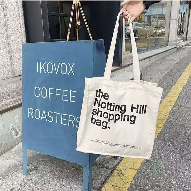
This high-contrast typography bag is an actual product shown in LUCKYSTAR’s Alibaba storefront. It demonstrates why simple flat artwork may be evaluated differently from a multicolour image. A product photo cannot by itself prove whether the production separation was a single spot, process black or another route.
6. Hybrid CMYK plus spot colour protects a critical brand tone
A hybrid print plan uses CMYK for the image and an additional spot separation for the logo, background panel or specialty finish. This can solve the common problem where photography is necessary but one corporate colour is visibly outside the acceptable CMYK simulation.
The trade-off is an extra tool/plate/cylinder, ink, press station, trapping decision, makeready and quality check. Define whether the spot knocks out the process image or overprints it. If transparent spot ink overlaps CMYK, the colour changes. If it knocks out, misregister can create a halo. The assigned printer should recommend choke/spread and print order.
Adobe’s spot and process colour reference notes that process and spot inks can be combined—for example, four process inks plus one corporate colour or varnish. Review Separations Preview and overprint behaviour before file release.
7. A Pantone-to-CMYK conversion is a simulation, not an identity
A Pantone number and a CMYK recipe describe different systems. A conversion table offers a process simulation under a defined reference condition. Some spot colours fall outside the reproducible gamut of four-colour process; saturated oranges, greens, blues, fluorescents and metallic effects can be especially challenging. The closest CMYK value may be useful but should not be renamed as the original spot colour.
A conversion reference can help compare a spot target with a process simulation, but some spot colours convert more closely than others. Once a brand accepts a specific CMYK simulation for a specific bag programme, record the process condition, substrate, white/backing and approved physical sample. Do not assume the same numeric build will transfer unchanged from laminated PP to unbleached cotton.
| Conversion risk | Why it happens | Buyer action | Approval evidence |
|---|---|---|---|
| Out-of-gamut spot | CMYK cannot reproduce the target chroma/hue closely | Keep a spot, accept a simulation or assess expanded gamut | Side-by-side physical comparison |
| Profile mismatch | CMYK numbers came from a different output condition | Convert using printer-supplied workflow/profile | Contract/process proof tied to production condition |
| Body-colour influence | Unprinted or transparent areas reveal substrate shade | Specify white or approve the colour interaction | Production material with the final white plan |
| Texture/detail loss | Dots and fine reverses interact with weave or surface relief | Simplify art, change screening/process or use smoother layer | Full-size critical-detail press sample |
| Screen-only approval | RGB display gamut, calibration and illumination differ | Do not release colour from a monitor alone | Signed physical target under defined viewing |
8. Material changes both spot and process colour
The ink touches a physical surface, not a colour code. Natural cotton is warm and textured; bleached fabric is lighter; dyed canvas can require opaque underbase; non-woven PP has bond-point texture; laminated woven PP may present a smooth film; kraft paper is brown; clear PVC/TPU allows contents and background to influence the graphic.
| Shopping-bag surface | Spot-colour implication | CMYK implication | Critical control |
|---|---|---|---|
| Natural cotton/canvas | Base warmth shifts translucent inks; large solids reveal texture | Dot detail and neutral balance are limited by weave and absorbency | Signed fabric lot and production-process print |
| Dark dyed textile | Opaque formulation or white underbase may be required | White base commonly supports process image; registration grows critical | White opacity, trap, hand and cure |
| Non-woven PP | Treatment, coating and bond points affect solid uniformity | Fine process detail may break across texture | Exact web/coating, treatment and adhesion |
| Laminated woven PP | Spot can print on or beneath film depending on construction | Reverse-printed film supports detailed image and broad coverage | Film, white layer, print order and laminate bond |
| Kraft/uncoated paper | Paper colour and absorption mute the target | Neutrals and shadows shift; uncoated profile/ink limit matters | Actual paper mill/shade and physical proof |
| Clear PVC/TPU | Transparent ink changes with background; white may isolate colour | White plate/backing and reverse/face print must be mapped | View over realistic contents and final layer stack |
9. Match the colour system to the printing method
Screen printing is efficient for one or a few spot colours. Four-colour process screen printing is possible but requires halftone capability, register and substrate control that may not suit every bag. Flexography and gravure can run process plus spot stations at volume. Digital methods typically accept RGB/CMYK artwork through a RIP but may use white, light inks or expanded device colours.
The appropriate method is inseparable from quantity, material and coverage. Review the complete shopping-bag print-method guide before treating Pantone or CMYK as a standalone purchase choice.
| Print family | Spot-colour fit | CMYK fit | Question for the factory |
|---|---|---|---|
| Direct screen | Strong for local one/few-colour logos and opaque solids | Possible only with qualified halftone/register workflow | Minimum dot/type, screen count, underbase and cure? |
| Web flexography | Separate brand station can supplement process or print simple art | Suitable for controlled repeating process work | What fingerprint/profile, plate, anilox and substrate condition? |
| Gravure film printing | Spot cylinder can protect a key solid | Well suited to detailed, high-coverage film graphics at scale | Which cylinders, white sequence, film and lamination stack? |
| Heat transfer | Spot appearance may be digitally simulated rather than premixed ink | Supports detailed multicolour image on qualified material | Is colour printed into transfer, cut from film or otherwise built? |
| Direct digital | Device simulates named spot unless it has a dedicated channel | Natural fit for variable/multicolour short runs | What RIP/profile, ink set, white/cure and achievable gamut? |
10. White ink is a colour-separation decision
White is often invisible on a design screen, but it can become the most important separation on a dark, transparent or coloured bag. It may sit under a direct print, behind a reverse-printed film image or only beneath selected elements. White changes opacity, hue, trap, tool count, print order, drying and hand.
Ask whether white is a full flood, selective support or absent. Name it as a spot layer such as WHITE_INK and show its relationship to artwork. A white object in the visual file is not automatically a production white separation. Confirm choke/spread so colour and white do not create visible halos.
11. Prepare artwork so spot and process plates are unambiguous
Use vector artwork for logos and high-resolution linked images for photography. Keep the document in the colour mode requested by the printer. Name spot swatches consistently; duplicate names such as “Pantone 186,” “PMS 186 C” and “Brand Red” can accidentally create multiple plates. Remove unused swatches and registration colour from visible artwork.
Inspect Separations Preview one plate at a time. Verify that the logo appears on the intended spot rather than on CMYK plates, that photography uses the process channels, and that white/varnish/foil layers are present only where required. Check overprint, knockout, transparency, gradients, rich black and total ink coverage according to the assigned printer’s specification.
Adobe’s current guidance on spot and process colours notes that converting a spot to process may reduce cost but can affect brand accuracy. The factory—not an automated export preset—should confirm whether conversion is acceptable.
12. Proof the colour system, not merely the visual file
A composite PDF cannot prove that the separations are correct. A desktop proof may simulate overall appearance but cannot show exact textile opacity, ink hand or laminate effect. Build proofing around the chosen route.
| Evidence | Best use | Does not prove | Approval note |
|---|---|---|---|
| Separation preview | Plate/channel content, white, overprint and knockout | Physical colour or adhesion | Save reviewed PDF/report with revision |
| Spot drawdown/strike-off | Ink colour, opacity and surface interaction | CMYK register, dot reproduction or bag conversion | Use actual material/finish and agreed ink deposit route |
| Colour-managed process proof | Expected CMYK tonal/colour relationship | All texture, gloss, white or production variability | Tie proof to the named production condition |
| Production-process sample | Actual inks/separations on intended substrate/film | Long-run drift or converted placement if still flat | Record materials, tools, press and settings |
| Finished golden bag | Overall colour, scale, folds, handles and layer appearance | Bulk consistency by itself | Sign visual and measurement acceptance |
| Bulk first-off | Actual production lot and print/conversion condition | Later stability without in-process sampling | Release only after process and spot checks agree |
The existing shopping-bag sample-development reference explains why a visual mock-up and a production-condition sample need different labels.
13. Pantone or CMYK changes MOQ and cost structure
A one-colour spot screen job may need one screen and one ink setup; two spots need more tooling and passes. CMYK normally needs four process separations and careful register, even if the visible design uses only a few muted colours. Hybrid work adds at least one extra spot station or pass. Film gravure adds cylinders; flexography adds plates; digital production reduces some physical tooling but can carry higher unit ink/handling cost.
Quote quantity per exact design and colourway. If one order has six background colours, three logo variants and two bag sizes, process efficiency depends on the actual matrix. A Pantone spot mixed for one body shade may require adjustment for another. CMYK images on dark versions may need different white support.
Ask for tooling, colour matching, white, test/proof, printing, lamination/transfer and conversion as separate quote elements. That reveals whether a five-colour hybrid is commercially sensible or whether the brand should simplify artwork.
14. Measure colour under an agreed production condition
Do not write a universal Delta E tolerance into an RFQ without defining instrument, illuminant/observer, measurement mode, backing, aperture, sample presentation, location and reference dataset. Texture, transparency and gloss can change measurement repeatability. A small aperture may read different parts of a woven surface.
Use both instrumental and visual controls. Instrumental comparison helps monitor a stable spot or process patch; visual review catches mottle, pinholes, trapping, flesh-tone problems, abrupt gradients and local register. For flexographic process work, ISO 12647-6:2020 provides a current framework for colourimetric aims and process-control responsibilities, but the buyer and converter must define the actual shopping-bag printing condition.
15. Diagnose common Pantone and CMYK failures
Spot matches the guide but not the approved bag: verify which physical target was authoritative, substrate lot, ink batch, deposit, cure and gloss. CMYK logo looks muddy: check whether an out-of-gamut spot was converted, whether the profile matches the press and whether unnecessary black/grey component affects the colour.
White halo surrounds the image: inspect white choke/spread and colour-to-white register. Fine text appears fringed: avoid a four-colour build for tiny text; consider single K or a dedicated spot. Photo is correct but corporate colour is wrong: compare the accepted CMYK simulation with a hybrid spot alternative.
Colour shifts after lamination: evaluate film, white backing, adhesive/extrusion layer, temperature and optical change. One batch differs although ink recipe is unchanged: trace substrate shade/treatment, pigment strength, viscosity, deposit, drying and viewing condition. An ink formula is a starting recipe, not proof of final appearance.
16. Image complexity should not override durability
CMYK detail has little value if the print cracks, rubs off or delaminates. Spot opacity has little value if an excessive ink film blocks in cartons. Test the selected ink/film/transfer on the finished bag under fold, dry/wet rub, pack hold and intended use. Use the shopping-bag QC protocol to connect colour inspection with construction and function.
A colour system also does not establish an environmental claim. Four process inks are not automatically more or less sustainable than two spot inks. Consider ink chemistry, white coverage, film, laminate/transfer layers, cleaning/changeover waste, setup rejects, durability and the final material-recovery route.
Company-claim boundary: LUCKYSTAR statements in this section are publisher self-description, not third-party verification, Pantone/Adobe/ISO certification, brand-colour approval, press characterization, laboratory result or assurance of a particular match, tolerance, MOQ, price, durability or delivery date. Confirm the contracting entity, assigned bag and printing/converting sites, exact material/layer stack, press/ink condition, physical target, proofs, samples, measurement method, inspection and release terms for the order.
17. How LUCKYSTAR describes its colour-system review
LUCKYSTAR states that its project team can compare spot, CMYK and hybrid separations around one locked shopping-bag construction and production route, subject to specification and written confirmation.
- Lock the receiving surface: record material lot/body colour, coating or film, transparent/opaque view, white/backing plan, finish and printed face before selecting a colour system.
- Map every separation: list process channels, each named spot, white, varnish, metallic/foil or other finish, overprint/knockout, choke/spread and print order.
- Return route capability: have the assigned printer state profile/fingerprint or physical matching route, gamut limits, minimum dot/type, total coverage, register, tool/station count and proof limitations.
- Use physical gates: separate screen/separation review, spot drawdown, process proof, production-material print, converted golden bag and bulk first-off.
- Define measurement: record reference object/dataset, instrument, illuminant/observer, mode, backing, aperture, sample presentation, locations and visual viewing condition before stating a tolerance.
- Quote the full system: separate colour matching, white, proofs/tests, tools, print, lamination/transfer, SKU changes, conversion, pack-out and reorder controls.
Review the public custom shopping bag options, the colour approval workflow and the print-route overview. Then send the material, artwork, physical target and SKU matrix for a route-specific separation proposal.
18. Send a colour-system-ready RFQ
| RFQ field | Buyer input | Factory response |
|---|---|---|
| Bag construction | Material, body colour, coating/film, size, printed sides and finish | Named receiving surface and suitable print route |
| Artwork content | Vector logos, linked images, gradients, small text and special effects | Preflight risks and process-specific limits |
| Colour intent | Pantone/brand reference, CMYK data/profile, spectral data if available | Recommended spot, process or hybrid separation plan |
| White / finish | White areas, opacity, varnish, metallic/foil and overprint intent | Station/tool count, order, choke/spread and appearance risk |
| SKU matrix | Units by material/body colour × artwork × size × finish × destination | Runnable quantity, changeovers, ink/tool plan and MOQ |
| Approval | Required proof, spot trial, process sample, golden bag and tolerance goal | Sample route, measurement condition and lead time |
| Commercial | Tool ownership, reorder horizon, deadline, packing and trade term | Separated setup/unit/ink/film/conversion/packing price |
Frequently asked questions
Is Pantone better than CMYK for shopping bags?
Neither is universally better. Pantone/spot colour is strong for a few critical brand solids; CMYK is practical for photographs and many colours. The best choice depends on artwork, substrate, print route, volume and accepted tolerance.
Can a Pantone colour be printed in CMYK?
It can be simulated using CMYK, but some spot targets fall outside the process gamut. Compare a physical simulation with the spot target and record whether the brand accepts the difference.
Why does the same Pantone colour look different on cotton and PP?
The receiving surface, body shade, ink chemistry, opacity, texture, coating and gloss differ. The Pantone reference communicates intent; the production ink must be trialled on the actual substrate.
Does CMYK always require four printing plates?
Traditional process printing uses four separations, but digital devices may use extra channels, while artwork may add white, spot colours or varnish. Ask the factory for the actual station/tool count.
Should a black logo use CMYK rich black?
Often a small black logo or text is safer in one black separation to avoid register fringes. Large black solids may need another strategy. Follow the assigned printer’s recommendation for the actual surface and process.
When should a brand use CMYK plus a Pantone spot?
Use a hybrid when photography or complex illustration needs CMYK but one corporate colour must remain closer to a protected target than its process simulation can achieve.
Is a HEX or RGB value enough for bag printing?
No. HEX and RGB describe screen-oriented colour. Provide print references and let the converter define spot or process data for the selected production condition.
What is a white underbase?
It is a printed white layer beneath colour on dark, coloured or transparent material. It improves opacity and changes the separation count, trap, cure, hand and cost.
How should CMYK artwork be checked before production?
Confirm document mode/profile, linked image quality, separations, overprint, black construction, white/spot layers, ink coverage and printer-specific limits. Then approve a proof and production-process sample.
Does Pantone printing always cost more?
No. A simple one-spot screen job may cost less than four-process work. Multiple spots or a spot added to CMYK increases tools, stations and setup. Compare the complete artwork and quantity matrix.
Conclusion
The right choice between spot colour and process colour is made at the intersection of artwork, material and production. Use spot/Pantone intent for controlled flat brand colours and special effects; use CMYK for photography, gradients and complex multi-hue graphics; combine them when a process image and protected corporate colour must coexist. Then define white, separations, proofing and measurement for the actual bag construction.
Explore LUCKYSTAR’s custom shopping-bag options. Use the Shopping Bags sourcing framework for category decisions and the main manufacturer evaluation guide for broader factory qualification.

Send LUCKYSTAR your bag material, artwork, colour references and quantity by design for a spot-versus-process recommendation.
Request a route-specific colour-system proposal
Use one material, artwork, physical colour target and SKU matrix so spot, CMYK and hybrid options can be compared.
Review LUCKYSTAR custom shopping bag options, then send your project details through the contact form or Email a project brief. The email link opens a draft for your review before sending.
Site assignment, substrate, ink/separation system, equipment, tools, proof, colour target, tolerance, performance, inspection, price, MOQ, packing, schedule and release terms are subject to due diligence, specification and written confirmation.