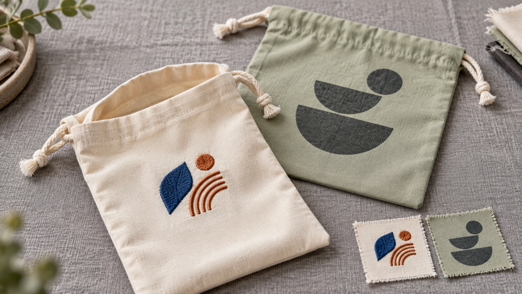
Pantone vs CMYK for Custom Drawstring Bags
The short answer: use a Pantone reference to communicate an important target color; use a process-color workflow when artwork needs photographs, gradients or many colors. But a Pantone code is not itself a promise of spot-ink printing, and “CMYK file” does not prove that a particular drawstring bag will reproduce the screen color. For this product, approve the body fabric, printed image, cord and stitching together on a physical sample. The material and decoration route determine what can actually be matched.
This guide focuses on a problem specific to custom drawstring bags: the buyer often wants one brand color across a dyed pouch body, a printed logo and separate textile components. Those may be made by different processes. For a broad explanation of the two graphic color systems, see our Pantone versus CMYK guide for shopping bags. Here the emphasis is the multi-component drawstring-bag approval decision, not another generic printing-method comparison.
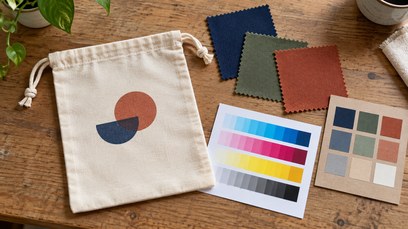
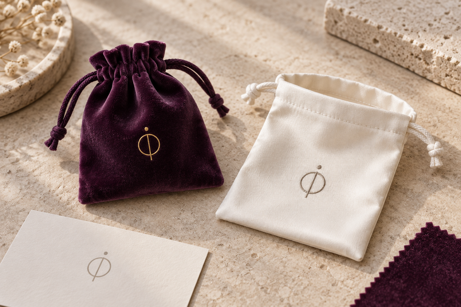
Illustrative concept based on a realistic drawstring-pouch construction, not a photograph of a LUCKYSTAR production order. The unbranded swatches and test strip show the different color targets a buyer must approve.
1. Identify which part of the bag must match
“Match our Pantone” is incomplete because a drawstring bag is not one color surface. The visible result may include a dyed or stock-colored fabric, printed artwork, a folded top channel, cord, seam thread and perhaps a pocket or lining. Ask whether the buyer wants identical color, a visually coordinated family, or simply a specific printed mark.
| Component | Typical color decision | Why the same code may look different |
|---|---|---|
| Main body | Stock fabric shade or custom-dyed material | Fiber, weave, finish and dye lot change appearance |
| Printed logo or graphic | Spot-like ink target or process-color reproduction | Ink/transfer, underbase and fabric color change the result |
| Drawstring cord | Separately sourced stock or custom color | Different fiber, texture and diameter reflect light differently |
| Top channel | Body fabric folded over or a separate component | Gathering creates shadows and may expose reverse side |
| Stitching | Thread shade chosen for matching or contrast | Fine thread can read lighter or darker on a textured panel |
| Pocket/lining | Separate fabric or print system | May be visible beside the body at the opening |
The first practical question is therefore “Which component is the master?” If the pouch body must match a retail collection, its approved fabric swatch may lead. If a campaign logo is non-negotiable, the printed mark may lead and the body can be a coordinated neutral. That decision should appear in the drawstring bag tech pack, not live only in an email thread.
Three different meanings of “brand color”
Distinguish a design-system reference, a manufacturing target, and an accepted production sample. A brand guide might name a Pantone color; the printer may make a closest achievable ink/transfer on the selected textile; the buyer finally approves a real sample under agreed viewing conditions. These are related, but not interchangeable.
2. Pantone is a reference system; CMYK is a process model
Pantone systems provide named color references. CMYK describes cyan, magenta, yellow and black process-color reproduction. In conventional graphic printing, a spot color uses a separately formulated ink, while process colors combine to create many hues. Adobe's spot-versus-process explanation notes that spot inks can be useful when few colors are critical, whereas process color is practical for photographs and complex artwork. The selected drawstring-bag method still has to be validated separately: textile screen printing, digital textile printing, transfer and sublimation are not identical to paper offset printing.
| Question | Pantone reference / spot-intent route | CMYK or process-image route |
|---|---|---|
| Main reason to use it | Communicate a critical target; investigate a dedicated ink where the method permits | Reproduce multi-color imagery, gradients or photographic detail |
| Ideal artwork starting point | Limited-color mark with defined separations | Continuous-tone or high-color-count art |
| Key caution | A code does not guarantee a match on fabric or prove spot ink will be used | A four-number build is profile- and substrate-dependent |
| Evidence to approve | Printed strike-off plus target reference on the chosen fabric | Printed proof with agreed profile/route, then sewn sample |
| Relevant cost driver | Color mixing, screens/setups and extra passes where applicable | Image preparation, transfer/print area and route-specific setup |
Do not write “Pantone printing” on a purchase order if you only mean “use this Pantone chip as our target.” Record both the reference and the planned physical print route. Similarly, ask what “CMYK print” means in the supplier's proposal: a four-color screen-print separation, a digital textile process, a transfer, or a simplified shorthand for full-color output.
3. Pick the right kind of Pantone reference
Pantone's color-systems overview distinguishes its graphic PMS system from Fashion, Home + Interiors (FHI) textile references. A PMS coated-paper chip and a cotton TCX swatch are different physical standards; one cannot be assumed to look identical on a matte pouch. Pantone's cotton swatch card is intended as a cotton-fabric reference, but the production bag still needs its own approved material sample.
| If the priority is... | Useful reference to ask for | Follow-up evidence |
|---|---|---|
| Printed logo color | Brand's exact Pantone graphic specification, including suffix and edition if available | Ink/transfer strike-off on production-intent fabric |
| Dyed cotton body | Approved textile swatch or physical master; TCX if that is the brand's system | Lab dip or production-intent fabric swatch |
| Coordinated polyester body | Physical textile master and material specification | Actual polyester shade sample from proposed source |
| Matching cord to body | Physical body swatch sent to cord source | Cord sample viewed beside finished bag |
| Multi-color artwork | Native art plus original color references | Route-specific proof and assembled sample |
Record the suffix; do not copy only the number
“Pantone 123” without its library and suffix is ambiguous. For procurement, retain the full designation the designer actually used, identify the physical reference and state whether it is a target or a required production method. Avoid converting a textile TCX reference into a graphic spot-ink instruction by guesswork.
4. Do not treat a Pantone-to-CMYK conversion as an identical color
Pantone's Color Bridge guide shows a spot reference beside its closest CMYK simulation on specified paper conditions. That is a helpful expectation-setting tool, not a guaranteed recipe for cotton, polyester, coated fabric or a transfer film. Adobe likewise notes that CMYK conversion depends on profiles and color-management settings. If a brand color falls outside the achievable gamut of the chosen route, agree on a closest acceptable textile result or revise the method.
For a drawstring bag, the conversion decision should be made on the intended fabric. A paper proof may look convincing while the printed pouch is warmer, duller or less opaque. A photograph of the pouch on a phone is even less reliable as an approval master.
A useful two-proof question
Ask for (1) the brand-color target or physical chip and (2) a route-specific print strike-off on the production-intent material. Place them next to the approved body swatch. If they differ, decide whether the priority is the printed logo itself, harmony with the bag body, or consistency with the broader campaign. Capture that decision before bulk production.
5. Match the color plan to the artwork—not only the logo
A one-color icon and a photographic illustration create different requirements. Our custom drawstring bag printing-method guide covers the broader decoration choices. For color specification, use this quick decision matrix:
| Artwork on the pouch | Starting color strategy | What to ask the supplier |
|---|---|---|
| One critical solid-color logo | Named target plus feasible spot-like print trial | Can the route reproduce the target on this exact base color? |
| Two- or three-color flat mark | Separate named targets and clear artwork layers | Are separate inks/passes needed; what registration is achievable? |
| Photograph or detailed gradient | Process-image route and color-managed proof | What substrate, profile and proof are used? |
| Photo plus critical brand mark | Test a hybrid or alternative construction | Can the mark remain a distinct color without compromising cost or hand feel? |
| All-over print | Panel/fabric print route and printed-fabric approval | What does the color look like after cutting, sewing and gathering? |
For a full-coverage design, read our drawstring full-surface graphics guide. Its print-before-sewing issues are different from a small centered mark, even when the same color target is used.
6. Fabric and ground color can overwhelm the ink specification
The same logo ink can appear different on natural cotton, white polyester, navy canvas or coated fabric. Natural fabrics are not optical-white paper; texture breaks up small printed areas; and an ink may need an underbase to show brightly on a dark ground. These are physical effects, not software mistakes.
On dark polyester, also consider whether heat or dye migration affects a light print. On a textured cotton pouch, fine halftones can look softer than on smooth paper. The buyer should approve the complete stack: fabric lot, base shade, print method, underbase if used, cure/transfer condition and finished construction. Do not call an untested sample “Pantone matched” merely because the file carries a Pantone swatch name.
White is not automatically white ink
In many process-image workflows, “white” in artwork means no process color on a white base. On a colored bag, that area may show the bag color unless a white underbase or other opaque method is specified. The requested white appearance must be stated as a physical feature and proved on the actual fabric. Our screen printing versus heat transfer guide explains why white layers and hand feel vary by route.
7. Treat sublimation as a separate technical case
Many polyester drawstring bags are proposed for full-color sublimation. Epson explains that sublimation favors white or light polyester/polyester-coated surfaces and does not use opaque white ink. Therefore, a designer cannot simply send a dark-fabric mock-up with a bright white CMYK logo and expect that route to deliver it. A different base, underbase-capable process or separate printed patch may be needed, subject to sample approval.
The decision is not “Pantone versus CMYK” alone. It is “what physical route can make the required color on this specific material?” See the polyester sublimation versus screen-printing comparison for the process trade-off; this article stays focused on the color specification and acceptance plan.
8. Approve the visible bag, including its gathered top
A drawstring pouch changes shape when its channel is cinched. Broad colored areas fold into shadows; a logo close to the channel may distort; a printed stripe can appear darker at the gathered top. Evaluate color in the states the buyer actually cares about: flat/open, filled/standing and closed. If the pouch is a dust bag or retail gift bag, photograph it beside the product packaging it accompanies.
The logo placement and print-size guide helps keep critical artwork out of moving zones. Color approval should use the same finished form; a flat swatch cannot answer whether the colored channel visually dominates the pouch.
Set a master component hierarchy
For a gift set, you may choose the box or product label as the visual master. For a standalone promotional pouch, the body swatch may be the master. If the cord is deliberately contrasting, record its approved color separately rather than forcing it into a nominal “match.” This avoids repeated revisions chasing an impossible identical appearance across different fibers.
9. Build a physical approval ladder
A sound approval sequence prevents the familiar mistake of approving an attractive digital preview, then rejecting the real bag. The sample-development guide explains version control in more detail.
| Stage | Sample or file | Decision to record |
|---|---|---|
| 1. Target | Complete brand reference and component color hierarchy | Which colors are critical, and on which parts? |
| 2. Body | Stock shade card or lab dip on proposed fabric | Is the main pouch color acceptable? |
| 3. Print | Ink/transfer strike-off on same fabric | Is the mark acceptable beside the body? |
| 4. Components | Cord, thread, pocket and lining samples | Exact match or intentional coordination? |
| 5. Sewn prototype | Open, filled and cinched drawstring bag | Is the overall visual experience acceptable? |
| 6. Golden sample | Signed/dated physical standard and art revision | What will bulk be compared with? |
If a fabric or print method changes after approval, treat it as a new color question. A previously approved Pantone target does not remove the need to recheck the new physical stack.
10. Agree on how color will be judged
Ask the parties to specify viewing light, orientation, comparison distance and which surface is compared with which reference. Textured fabric can show nap or direction; a small ink patch can seem different from a large field. Instrumental color data can support the decision when the supplier and buyer agree on the method, but a universal “perfect match” or unnegotiated ΔE threshold is not a defensible promise for every pouch construction.
Review the important states under a repeatable lighting setup and keep the approved master protected from fading and handling damage. If a color is sensitive to light-source changes, compare under more than one relevant illumination before deciding whether the project can tolerate the difference. The reference must be an approved physical sample, not merely a screenshot.
Record an acceptable shade band when appropriate
For large quantities or repeated orders, the buyer can approve a master plus acceptable light/dark boundary samples, if feasible for the route. The limits should be documented and recognizable at inspection. Do not invent universal numeric tolerances in a blog post; agree them in the purchase specification and sample record.
11. Prepare artwork that will not silently convert colors
The file should distinguish named target colors from process imagery. A flat one-color logo should not be accidentally rasterized into a four-color image if a separate ink is intended. Conversely, a photographic image should not be described as a single Pantone color. Specify linked images, embedded profiles where relevant, clear separations, and the approved master version.
| Handoff item | Needed instruction | Frequent failure if omitted |
|---|---|---|
| Target-color list | Full designation, suffix, role and physical reference | Wrong color system or outdated chip selected |
| Print-route note | Screen, transfer, textile digital, sublimation or other proposed route | “CMYK” interpreted as a production method |
| Logo layer | Vector master and color intent | Tiny process dots replace a desired solid mark |
| Image layer | Linked high-quality image and color-management assumptions | Profile conversion surprises at output |
| Ground/underbase | Whether fabric color or opaque white is expected | White areas disappear on colored fabric |
| Version control | Art revision, bag specification and approval date | Old file reused on a reordered lot |
Adobe warns that spot colors can be converted to process colors during certain output operations. Ask for a separation preview or production proof where this distinction matters; do not rely on the swatch name shown in the designer's file alone.
12. Diagnose color disputes before changing the code
If a finished pouch looks wrong, the cause may be material, print, viewing conditions or a mismatched reference. Changing CMYK numbers immediately can make the next sample worse.
| Symptom | First question | Likely next check |
|---|---|---|
| Logo too dull on dark pouch | Was an opaque underbase specified and sampled? | Compare actual print stack with approved strike-off |
| Body shade differs from a paper chip | Is the paper chip the approved textile target? | Compare to physical fabric master on same fiber |
| Front and back seem unequal | Were panels from one print/dye lot and orientation? | Review flat panels and sewn bag under same light |
| Cord looks off despite same code | Is it a different fiber/finish? | Compare physical cord against body, not numeric code |
| CMYK image differs from PDF | Which profile and print method were used? | Check proof and output settings |
| Reorder drifts from first order | Was the original physical master retained? | Audit fabric lot, print route and file revision |
Also separate initial color appearance from rub fastness, wash performance or dye migration. A visually good sample can still need use-specific testing. Claims such as “colorfast” should be attached to a defined test, material and order, not inferred from a Pantone reference.
13. Plan reorders as a controlled color transfer
Repeatability comes from a traceable reference set: approved fabric swatch, printed strike-off, cord/thread samples, finished golden bag, artwork files, supplier route and inspection notes. If a stock fabric shade changes or a printer switches chemistry, a new approval may be needed even if the purchase order repeats the same Pantone number. The same principle is discussed in our logo and color consistency guide, but a drawstring bag adds cord and gathered-channel components.
Keep an order-level record of which component is permitted to vary, which must be held to the master, and who can approve a substitution. An “equivalent” cord or body fabric should not enter bulk without visual sign-off when it affects the brand presentation.
14. How color choice affects price, MOQ and timing
A spot-like ink may need mixing and setup; a custom-dyed body shade may need a separate material minimum; process imagery may require a route-specific proof; a matching cord may have its own sourcing constraint. These are different cost drivers. There is no universal rule that Pantone is always expensive or CMYK is always cheap for drawstring bags.
Quote the full construction: material, body color, artwork method, print area, number of versions, component colors, sample stages, packaging and inspection scope. Ask for alternatives where appropriate—for example, stock body plus accurately printed mark versus custom body shade plus a simpler logo. Our MOQ and production-time guide explains why figures must be confirmed against the exact brief. All prices, minimums and timing are subject to written order-specific confirmation.
15. Why choose LUCKYSTAR for a color-sensitive bag project?
LUCKYSTAR presents custom drawstring bags, OEM/ODM coordination and sample service to B2B buyers. For a color-sensitive order, the practical advantage we can offer is a single project conversation linking pouch material, printed artwork, cord/channel construction, approval sample and quality criteria. That is more useful than simply accepting a Pantone code without asking what it means on each component.
We encourage buyers to request a route-specific feasibility response, a physical sample plan and written acceptance points. Our custom bag manufacturer guide and drawstring manufacturer selection guide explain how to evaluate those responses from any supplier, including us. We do not claim an unverified owned print facility, universal certification, fixed color tolerance, MOQ or lead time here; the specifics depend on the order and approved evidence.
16. Send a color-ready RFQ
Share these inputs to receive a useful answer rather than a generic “we can match it”:
| RFQ input | What to include |
|---|---|
| Bag format | Finished dimensions; flat/round/gusset bottom; channel, cord and pocket details |
| Material | Fiber, construction, weight/finish if known; acceptable alternatives |
| Color hierarchy | Main body, logo, cord, stitching and lining: match or coordinate? |
| References | Full Pantone designation or physical master; current approved sample if reordering |
| Artwork | Vector logo, linked images, print size, positions, version count and rights |
| Print intent | Critical solid color, full-color image, all-over graphic or hybrid |
| Quality | Viewing condition, golden sample, shade boundaries and use tests to agree |
| Commercial scope | Quantity by color/artwork, packaging, destination and target window |
Request separate approval of the fabric color and the printed color before accepting a combined bag. Then approve the complete pouch beside its cord and any matching packaging.
17. Frequently asked questions
Does a Pantone number guarantee the drawstring pouch will match the brand guide?
No. It identifies a target in a particular color system. The bag's fiber, dye/ink, base shade, finish and viewing condition all influence the result. Approve a production-intent material and printed sample.
Is CMYK better for every full-color drawstring bag?
Process-color approaches are often appropriate for multi-color or photographic artwork, but the actual textile process must be specified. Sublimation, transfers and direct textile processes have different substrate and white-ink limits. Test the route on the selected fabric.
Can the body, print, cord and stitching all use one Pantone code?
They may all reference one desired brand shade, but different materials rarely appear identical by code alone. Specify which component leads and approve the others as physical matches or intentional coordinates.
Which Pantone guide should I send for a cotton bag?
Send the brand's approved full color designation and, if available, a physical textile reference such as the applicable cotton swatch. Also send a physical master from a previous order when continuity matters. Do not assume a coated-paper chip is an exact cotton result.
Do I need a new sample for a reorder if the code is unchanged?
Often a first-off comparison is still prudent. If fabric source, lot, printer, ink, route or cord changes, a new sample may be necessary. Retain the original signed golden bag and component references to make that decision traceable.
Conclusion: approve the physical color system, not just the file
For custom drawstring bags, Pantone and CMYK answer different parts of the brief. The defensible sequence is name the target → identify every colored component → choose a feasible print/material route → compare physical strike-offs → approve the sewn and cinched bag → retain a reorder master. This makes color a managed production decision rather than a promise attached to a code.
If your team has artwork and a target shade, send LUCKYSTAR your bag brief. We can discuss material options, a color proof and a project-specific quotation, all subject to specification and written confirmation.

Technical references: Pantone Color Systems, Pantone Color Bridge, and Adobe Spot and Process Colors. These explain color concepts; they do not certify a particular LUCKYSTAR bag or production lot.